Wednesday, January 31, 2018

How Minimum is the Minimum Wage?


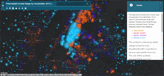
Yesterday we looked at Esri's Predominant Income Range by Households map, which shows how much money people are earning in each census tract in the United States. Esri has also released a story map this week which looks at the history of The Ever-Changing Minimum Wage.

The first federally mandated minimum wage was introduced in America in 1938. It meant that all employees had to be paid at least 25 cents an hour. The federal minimum wage is now $7.25 an hour but it hasn't been raised since 2009. You can view the current minimum wage in each state on Esri's map.

The Esri map includes an animation showing how the minimum wage has fallen or risen in real terms in each state over the last 48 years. This map illustrates how inflation has outstripped any rises in the minimum wage. In fact in 2018 the highest-paid minimum wage worker (who would work in the District of Columbia) will earn less than the highest-paid minimum wage worker (in Alaska) in 1970.

Esri's Ever-Changing Minimum Wage includes a map showing the Living Wage in each state. This is the real wage that a worker need to earn in a state in order to live there. Regardless of the local minimum wage, all states fail to guarantee minimum wages that actually match up to the cost of living in the state.

Some cities, counties and states have taken it upon themselves to raise wages locally. There is now a growing divide between states that have increased minimum wages and are at least bringing minimum wages closer to the cost of living, versus those states that are slower to raise minimum wages (or don’t raise wages at all).

What is Here & There


What is Where is a map based point of information search engine. Using Whats is There you can search any area in the world for lots of different types of local points of interest. The map uses data from OpenStreetMap to help you find out what is available in a defined search area.

There are lots of potential use cases for What is There. These include, for example, researching an area before buying a house or for looking for potential nearby competitors before starting a new business. The search facility allows multiple conditions and groups of conditions to be applied to a search at the same time. It also allows you to define a search area by drawing on the map.

You could use What is There to find all the cafes within a set distance of a potential new home. Alternatively if you want to start your own cafe you could use What is There to find all the postcodes without a cafe within a two miles radius.

What is There includes the option to save and load your point of interest search projects. You can also export the results from a search in CSV format and open the results in your favorite spreadsheet program.

Mapping with NASA


NASA'a Global Imagery Browse Services (GIBS) provides access to satellite imagery of the Earth. This includes NASA's most recently captured satellite imagery, available just a few hours after an overpass. It also includes access to historical satellite imagery spanning back 30 years.

You can view GIBS satellite imagery in NASA's own interactive Worldview map. Alternatively you can use the data in your own online maps. NASA's GIBS imagery is available in common online map tiling formats, including Web Map Tile Service (WMTS), Tiled Web Map Service (TWMS), Keyhole Markup Language (KML) and Geospatial Data Abstraction Library (GDAL). The imagery is also available in different map projections, including Geographic / Equirectangular (EPSG:4326), Web Mercator (EPSG:3857), Arctic Polar Stereographic (EPSG:3413) and Antarctic Polar Stereographic (EPSG:3031).

If you want to use GIBS in your maps then you should check out the GIBS API for Developers.

If you don't like reading documentation then you might want to skip straight to NASA's GIBS Web Examples on GitHub. This page includes working examples of NASA's GIBS imagery being used with some of the most popular mapping libraries, including the Google Maps API, Leaflet, OpenLayers, Cesium and the Bing Maps API. For each of these libraries NASA has provided a demo map featuring three different map projections. It has also included a demo for each JavaScript mapping library of recent satellite imagery with a slide date control for viewing the satellite imagery by date.

Tuesday, January 30, 2018

The LGBTQ+ Traveler


Destination Pride provides a guide to the possible safety of holiday destinations around the world for LGBTQ+ travelers. Using information on relevant local laws and social attitudes Destination Pride hopes to give a basic safety overview for people traveling to new destinations.

Type a destination into Destination Pride and you can view the location's LGBTQ+ safety ranting on an interactive map. The map sidebar includes a rainbow flag which breaks down the safety ratings for the location into different categories. Each colored bar on the flag represents a different category, including marriage equality, sexual activity laws, anti-discrimination laws and civil rights & liberties (you can click on the individual colors to reveal what they represent).

Destination Pride was created by PFLAG Canada, an organization offering peer-to-peer support for individuals with issues of sexual orientation, gender identity and gender expression.

Income Inequality in Your Town


Perhaps the biggest political issue of our time is the ever increasing rise in income inequality. In the United States the gap between the rich and everyone else has been growing for the last thirty years. Esri has created a new interactive map which allows you to explore how this inequality of income distribution plays out in towns and cities across America.

Esri's Predominant Income Range by Households map shows how much money people are earning in each census tract in the United States. The map uses income data from the 5-year American Community Survey in 2016 to show the income range of the most people in each tract. Using the map you can explore the reality of income inequality in your local neighborhoods.

While exploring the map you might spot patterns which recur in states, cities and communities across the country. For example you should be able to spot the income divide between many metro and rural areas. In college towns you might see low income student-dominated neighborhoods surrounded by wealthier neighborhoods.

The map reveals that a number of cities, such as Philadelphia, Seattle and Houston have a thriving downtown core. While cities such as Detroit and Cleveland have urban centers which are struggling or dying.

From Coastal Trade to Global Shipping


A new interactive map is providing valuable insights into how England's maritime empire began. In late Medieval and Tudor England shipping involved mainly coastal trading. However from these humble beginnings was to emerge a merchant navy that would soon be trading with all parts of the world.

Medieval and Tudor Ships is a database of merchant ships and the voyages they undertook in the period from 1400 to 1580. The database includes records of 50,000 ship voyages out of over 400 English, Welsh, and Channel Islands ports. From the database Medieval and Tudor Ships has created two interactive maps. A Ports Map shows all the English and Welsh ports in the database. The other, Routes Map, shows the origins and destinations of the ship voyages in the database.

The Routes Map only shows the origin and destination ports of voyages, it doesn't show the actual route taken by ship between the two ports. If you click on a port however you can view all the other ports that ships have traveled to and from. The map therefore does provide a great overview of where individual ports had trading relationships in the Tudor period.


Skip forward 200 years and merchant fleets are trading all over the world. Wooden Ships is an interactive map which allows you to explore European maritime activity from 1750 to 1850. The visualization is based on digitized shipping logs from the Climatological Database for the World's Oceans 1750-1850.

Using the map menu you can view a mapped visualization of the marine journeys undertaken by British, Dutch, French and Spanish ships. You can use the time-line at the bottom of the map to select any range of years from 1750 to 1850. The map also allows you to filter the data by wind speed patterns and by other weather and climatic conditions. If you click on a hexbin on the map you can also read entries from the ship logbooks yourself.


Morgan Herlocker has also used the Climatological Database for the World's Oceans to create an interactive map of international ship traffic between 1750 and 1850. These historical ship logbooks contain a wealth of data both about the routes taken by ships and the weather conditions encountered by the ships during their voyages.

Morgan took the location data from these 100 years of ship logs and plotted them on a Mapbox map. The thousands of data points in Ships Logs were processed into vector tilesets using tippecanoe. One thing that clearly emerges from mapping all this data is the routes of the major shipping lanes from 1750-1850.


Skip forward another 150 years and there really are very few areas of the world's oceans and seas which aren't a part of the global shipping trade. Shipmap.org is an outstanding animated interactive map visualizing the movements of the global merchant shipping fleet over the course of 2012.

The map uses AIS shipping data from exactEarth. This data is presented on a Leaflet powered map using custom designed map tiles. The map tiles include bathymetry and major river data from Natural Earth.

Using the map you can explore the movements of different types of cargo ships over the course of 2012. You can also filter the ships shown on the map by type of cargo vessel.

There is so much to love about this map, from the huge amount of animated data visualized on the map to the design of the map tiles themselves. I also really like the brilliant audio guide to the map and the data displayed. This audio guide takes you on a little tour of the world explaining some of the interesting patterns that emerge from the data and the worldwide merchant shipping trade.

Monday, January 29, 2018

Spying on the Spies with Strava


The Pentagon on the Global Strava Heatmap

Over the weekend Nathan Ruser posted on Twitter an observation that the Strava Global Heatmap is a very good source for finding United States military bases around the world. Since then newspapers such as the Washington Post & The Guardian and other Twitter users have been busy posting screenshots of military bases in Syria, Afghanistan and elsewhere, which are lit up on the Strava heatmap.

Soldiers using Fitbit, or other sports tracking apps, appear to be happy to share their locations with Strava as they patrol around US military bases. Even worse is that the Strava map can be used to find popular running routes that military personnel like to take outside of these military bases. The Strava Global Heatmap can therefore be used to discover not only what could be patrol routes inside military bases it can also be used to find out where personnel like to run or cycle outside of these same bases.


GCGQ

You can even use the Strava Global Heatmap to track the movements of personnel inside buildings. The screenshot at the top of this post shows the tracks of Strava users wandering around the Pentagon. It isn't just the U.S. military who haven't warned staff about using tracking devices in sensitive areas. The UK's GCHQ (Government Communications Headquarters - signals intelligence) on the Strava heatmap also includes the tracks of lots of staff members wandering around the supposedly top-secret listening station.


If spying on spies appeals to your fine tuned sense of irony then you can also view the tracks of United States' spy planes. The FBI and the Department of Homeland Security make daily flights over American cities in spy planes equipped with high-resolution video cameras and cell phone tracking equipment. Buzzfeed has analyzed data from Flightradar24 and identified around 200 federal aircraft. Using the Flightradar24 data Buzzfeed has also mapped some of the flights of these planes as they spy on American cities.

Spies in the Skies explores some of the reasons behind the use of the planes by the FBI and the DHS. It also includes an animated interactive map which plots the flights of the planes between mid-August to the end of December last year. On the map the FBI planes' tracks are marked in red and the DHS plane tracks are shown in blue.

If you zoom-in on the map you can see the distinctive circular flight paths of the planes, presumably as the planes monitor a single location on the ground. If you zoom-out you can get an overall picture of where in the USA the FBI & DHS planes seem to be most active. The DHS seem to be most active around towns and cities near the Mexican and Canadian borders. The FBI planes seem to regularly operate all over the USA.

The Culture of Street Names

When you visit a typical English village for the first time you probably won't need a map. In most English villages you can guide yourself just by using the road names.

For example, if you arrive by train then you will probably emerge from the station onto Station Road. Walk down Station Road (past the Railway Arms / Tavern or Inn) and you will come to the High Street. Walk past all the shops on the High Street and eventually you will find Church Lane. Walk down Church Lane and you will find the village's pretty Norman church.

If you visit a German village then you could probably use the exact same directions (translated into German).

It seems to be a common feature in Europe that the most popular or most common street names are named for important landmarks. For example, streets are commonly named after churches, stations and schools. The main road, where most of the shops are located, is normally called 'Main Street' (in the UK it may often be called the 'High Street' instead).

In north America things are a little different. Most European towns have grown organically over centuries, often around important local landmarks such as a church or market. North American towns, on the other hand, have more often been planned, usually using a grid system. If you have a grid system then it makes sense to number your roads.

According to City Lab half of all American cities have some sort of numerical street naming system. The Geography of Street Numbering in US Cities looks in some depth into the advantages and popularity of giving streets numbers as names.

You can compare the popularity of different street names in north America and Europe in the table below. This shows the top ten most popular street names in the USA, Canada, England and Germany.

USA
Canada 
England 
 Germany (translated)
Second Second  High Street Main Street
Third First Church Lane  School Street
First Third Station Road  Garden Street
Fourth Main Church Street Station Street
Park Fourth Mill Lane Village Street
Fifth Maple Church Road Mountain Street
MainFifth Green Lane Birch Road
Sixth Park Main Street  Lime Street
Oak Church School Lane Church Street
Seventh Sixth New Road Forest Street

You can see for yourself how in the USA and Canada numbers dominate the top ten most popular street names. In Canada the Maple is very popular (for obvious reasons), whereas in the USA the Oak appears to be the most popular tree.

Once you get past the highest numbers then both the USA and Canada do start to name streets for local landmarks, buildings or geographical features. For example, streets might be named 'Park', 'Church' or 'Lake'.

If you are interested in the cultural and historical background of street names then you might also like:

The Most Popular Street Names in America
How Popular is Your German Street Name?

Sources:
USA street names - FiveThirtyEight
Canada - the10and3
England - Journal of Economic Geography
Germany - Die häufigsten Straßennamen in Deutschland

Super Moons & Glitter Balls


On 31st January you could witness a very rare total lunar eclipse of a super moon. If you live in the USA then you should be able to see the eclipse before sunrise on Wednesday. If you live in the east of Russia, the Middle East, Asia, Australia or New Zealand the eclipse can be seen during moon-rise on Wednesday morning.

Those who live on the west coast should get the best view in the United States. However even those living on the east coast should be able to see at least a partial eclipse of the moon (weather permitting). Time and Date has created an interactive map for the event. Their Map of the Total Lunar Eclipse shows where a total eclipse will be visible and where a partial eclipse can be seen.

If you click on the map you can view the length of the eclipse at the selected location and when the eclipse will begin and end.


If the lunar eclipse won't be visible where you live then you might want to look out for the Humanity Star instead. The Humanity Star was launched into orbit on the 21st January. It is a geodesic satellite with 65 reflective panels. As the satellite spins it reflects the sun's light, so that it can be seen from Earth with the naked eye. The satellite orbits the Earth every 90 minutes. The orbit of the Humanity Star will decay after about nine months. Then, as it re-enters the Earth's atmosphere, it will completely burn up.

If you want to view the Humanity Star then you can find out when it will be visible from your location on the Humanity Star tracking map. The map shows the satellite's current position above the Earth, it's track and when it can next be seen from your location.

Saturday, January 27, 2018

The Most Popular Street Names in America

This week German newspaper Die Zeit carried out some interesting analysis of German street names. Unsurprisingly they discovered that some of the most popular street names have a historical or cultural significance. This is less true in most areas of the USA.


Cartographer Jonah Adkins has discovered that the most popular street names in the southeastern state of Virginia do have local historical significance. In The Open (Data) Roads of Virginia he reveals that 'Main Street' is the most popular name in the Commonwealth but the next five most popular street names all have more historical significance. 'Lee' is the second most popular name, commemorating Robert E Lee commander of the Confederate States Army and the Army of Northern Virginia. The next most popular names (in order of popularity) are Richmond, Washington, Virginia and Jefferson.

Jonah also discovered that the most popular suffixes in Virginian street names are Road, Drive, Street, Lane, Avenue and Court.

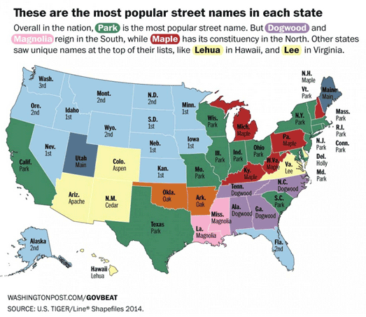
It isn't that surprising that 'Main Street' is the most popular street name in Virginia. It is by far the most common name for roads in the United States as a whole. In 2015 the Washington Post looked into the most popular road names in the USA. In We counted literally every road in America they reveal that 'Main Street' is the most popular street name. This is followed by streets called 'Park', 'Second' and 'First' - in that order.


In most analysis of street names 'Second' and 'First' usually come ahead of 'Park'. However most lists do agree that there are more Second Streets than there are First Streets. The WaPo argues that this is probably because the primary thoroughfare in most towns is called 'Main Street' and not 'First Street'

What the Washington Post's list reveals however is that Virginia is a bit of an anomaly with its interest in history. Americans as a whole prefer their streets to have numbers or names of trees. The WaPo list finds that after numbers more streets are named after types of tree than anything else. However Presidents' names are the third most popular category of street name in the USA. So at least some American street names have a sense of history.

If you want to know the most popular street names in your state then you can find a list of the top ten street names in each state in the Washington Post article.

Friday, January 26, 2018

How Much is Your Vote Worth?


If you live in Wyoming your vote is worth 3.52 times more than a voter in Florida. This is because of the uneven spread of electors per state in the United States. Wyoming has more votes in the Electoral College per registered voter than any other state.

What's Your Vote Worth is an interactive story map which explores the history of America's voting system, the right to vote and how voter representation is skewed under the present system and map. The story map includes a choropleth view of how much one vote is worth in each state compared to Wyoming. For example, it takes 3.19 voters in California or 3.4 voters in Pennsylvania to equal one Wyoming voter.

After exploring the uneven voting power of different Americans What's Your Vote Worth goes on to examine how gerrymandering is used to skew your vote even more. It looks at examples of gerrymandering in a number of states. In particular it looks at examples where voting district boundaries have been redrawn to 'pack' or 'crack' votes. Packing involves redrawing boundaries so that you pack voters who tend to vote for a particular party into one district. Cracking involves diluting like minded voters into many different districts.

 Petrichor GeoViz Studio examines the issues behind their interactive map in more detail in an article called What Your Personal Geography Means to Your Voting Power.


FiveThirtyEight, as part of its Gerrymandering Project, has had a go at redrawing America's voting districts for themselves. In the Atlas of Redistricting FiveThirtyEight has created a number of new congressional maps, each designed with a different goal in mind.

These alternative congressional maps show how voting districts could be redrawn in order to favor Republicans, to favor Democrats, to promote proportionally partisan representation and to maximize the number of majority-minority districts.

How Popular is Your Street Name?


Die Zeit has created an interesting interactive map which shows the popularity of German street names. If you enter your street name into the application you can view a map showing all the other streets in Germany which share your road's name.

Straßennamen: Wie oft gibt es Ihre Straße? reveals some interesting geographical patterns in the distribution of different street names. For example streets named after Ernst Thälmann, the leader of the Communist Party executed by the Nazis, are found almost exclusively in the former East Germany. The map includes a number of links to other street names which have a distinctive spatial distribution.

The map was made possible by creating a database of street names from OpenStreetMap. Using the database Die Zeit has discovered that the most popular street names in Germany are Hauptstraße, Schulstraße, Dorfstraße, Gartenstraße and Bahnhofstraße. They also discovered that the distribution of German street names reveals a lot about the country's history and culture. They explore this aspect of the map further in Straßenbilder: Mozart, Marx und ein Diktator.


If you live in Berlin then you can learn more about local street names with Straßenkrieg. Straßenkrieg is a fascinating map that reveals the history behind the many Berlin street names which have a military connection. The map highlights Berlin streets which have been named after battles, important military leaders or German army regiments.

All the military connected roads are highlighted on the map with colored lines. The colors indicate the historical period associated with the road's name, e.g. Prussian, the Weimar Republic, National Socialism or post-WWII. If you select a road on the map you can read a brief explanation of the military relevance of the road's name and click-through to read a more detailed account of the person or battle memorialized.

Thursday, January 25, 2018

Educating Boston


Ungentry is a tool for mapping Boston census data over time. It allows you to explore how Boston's demographics and housing market has changed over time. Ungentry is designed to show how Boston's neighborhood are changing and how susceptible they are to gentrification.

You can explore three different categories of data on the map, demographic, financial and housing data. When you choose a data set from one of these three categories you can see it visualized on top of three different maps - one for 1990, one for 2000 and one map showing the data for 2010.

A choropleth layer on each map allows you to see how the selected data has changed over time. For example, in the screenshot above you can see that most Boston neighborhoods are becoming more educated. In 2010 most neighborhoods had a higher proportion of the population with a college degree, compared to 1990 and 2000.

The data used in Ungentry comes from the 1990 and 2000 US Census and the 2008-2012 American Community Survey.

Wednesday, January 24, 2018

1890's Seattle in 3D


The Capitol Hill Historical Society is using Esri's CityEngine to recreate a 3D map of Seattle as it looked in the 19th Century. The result is Broadway and Denny in 1893, a 3D map of the area around Broadway and Denny.

The map sidebar provides a fascinating guided tour of 19th Century Seattle. As you scroll through the tour you are shown around the 3D model of historical Seattle while learning about the city's historical buildings and the people who lived in them. You are shown the homes of some of Seattle's earliest families, such as the Taylors, the Lloyds and the Pinckneys.

The map is still under development but already provides a neat demonstration of how CityEngine can be used to recreate historical locations in 3D. The 3D buildings on this map, at the moment, are little more than basic cubes but even so the map is still able to convey a real sense of the city in the 19th Century. The vintage base-map of Seattle is also not great when viewed up close.

I believe the Capitol Hill Historical Society hopes to find a more high-definition base-map and create more sophisticated building models, which will only help to create a more realistic map of old Seattle. Perhaps one day it will even rival Geneve 1850.


Geneve 1850 is the gold standard of 3D historical maps. In the nineteenth century Swiss architect Auguste Magnin created an amazing 3D model of the walled city of Geneva. You can visit the physical 3D model at the Maison Tavel in Geneva. Alternatively you can immerse yourself in the interactive 3D map of Geneve 1850 instead.

Geneve 1850 is an epic online interactive model of 1850's Geneva. The map allows you to immerse yourself in and explore Geneva as it looked in the mid-nineteenth century. To create this digital model of historic Geneva engineers scanned Magnin's original model in high definition. They were then able to recreate the 2,000 buildings (and their 40,000 windows and 8,000 skylights) in this digital model of the original.

The result is truly impressive. You can explore the city at street level, wandering around old Geneva on the ground. Alternatively you can take a bird's eye view tour of the city, flying a few feet above the city's rooftops. A menu provides a long list of important landmarks in the city which allows you to quickly navigate to different places in the city. Information points on the map also allow you to read about the history of the city's most iconic buildings.

How to Evict a City


There isn't a single census block in the greater Kansas City area which has not had an eviction case. That doesn't mean that eviction cases are spread evenly across the city. The most evictions have occurred in the poorest neighborhoods and the biggest factor which predicts whether or not someone will be evicted in Kansas City is race.

The Kansas City Eviction Project has mapped out 105,000 eviction cases in Kansas City from 2006-2016. The map includes a choropleth layer, which I assume reflects the percentage of evictions per population of each census block. If you hover over a block on the map you can view the number of eviction cases in that block. You can also view some demographic details, such as the percentage of the population who are black, the percentage who are white and the median income.

Individual properties are also shown on the map using colored dots. These dots are colored to indicate the number of eviction cases issued at that property. If you select a dot on the map then you can view how many notices to vacate have been served and when the last eviction case was filed at that property.


Rent control is disappearing fast in New York. ProPublica reports that since a 1994 City council vote on vacancy decontrol 250,000 New York apartments have lost their rent stabilization status. The 1994 vote allowed landlords to "escape regulation and charge market rates once tenants moved out of apartments that cost at least $2,000 a month".

The ProPublica report on the 1994 vacancy decontrol vote (and its consequent affect on New York's rental market) suggests that some unscrupulous landlords have, since the change in the law, sought to drive out rent stabilized tenants in order to hike up rents.

ProPublica's interactive map Tracking Evictions and Rent Stabilization in NYC shows the number of eviction cases that were made in New York City apartment blocks between January 2013 and June 2015. There may not be a direct correlation between the number of eviction orders in New York and the desire of landlords to drive out rent stabilized tenants. However the ProPublica map certainly shows an incredible number of eviction orders have been made against New York tenants in recent years.

Clicking on the apartment buildings colored on the map reveals the number of eviction orders placed on tenants (and the likely rent stabilization status of the building's apartments). It is truly remarkable how many apartment buildings in New York have had over 100 eviction orders served on tenants in such a short space of time.


The No-Fault Evictions Map visualizes properties in San Francisco where landlords have evicted their tenants using the controversial Ellis Act. It shows both individual properties and an overall choropleth view which shows which San Francisco neighborhoods have seen the most eviction.

The Anti-Eviction Mapping Project has also been mapping Ellis Act Evictions in San Francisco for a number of years. Their Ellis Act Evictions Map features an animated timeline map of Ellis Act evictions in San Francisco from 1997 to the present day.

The Ellis Act gives landlords the right to evict tenants in order to "go out of business". Judging by this interactive map some San Francisco landlords have gone out of business quite a few times now.

Europe's Population in 3D


3D Global Human Settlement is a WebGL visualization of Europe's population. The 3D model shows the population of Europe as peaks and troughs, where height represents population density.

On this map Istanbul has the highest peak, followed by Paris. This suggests that the city centers of both these cities are densely populated. Both Moscow and London are normally said to have a larger population than Paris. On this map they both have broader mountains than Paris, which suggests their populations are more evenly distributed rather than concentrated in the center, as Paris' population appears to be.

The data for the map comes from the European Commission's Global Human Settlement Layer, which derives from analysis of satellite imagery.

Tuesday, January 23, 2018

What Each State is Reading


Last year Margaret Atwood's The Handmaid’s Tale was the top selling novel on Kindle in every state apart from Ohio and Utah. The states that read the most books, based on Kindle's most readers per state population, are nearly all northern states.

2017 - The Year in Books is an Amazon data visualization of the top selling fiction and non-fiction books in the USA last year. The visualization includes an interactive map which shows the ten states that read the most in the United States. The map also shows you the three most sold books in each state. If you click on a state on the map you can view the first, second and third most sold book in that state.

Amazon's data visualization also lists the top selling non-fiction books in the USA and the biggest selling audio books. It includes a look at the trends in book cover designs, the best selling translated books, the most 'wished for' books and the books which were given as presents the most times.

Russia's World Cup Stadiums


This year Russia are hosting the 21st FIFA World Cup. Twelve stadiums will be used in the competition. Five of these will be entirely new stadiums. One, the Volgograd Arena, will be entirely rebuilt and one, the Central Stadium in Yekaterinburg, is being upgraded for the tournament.

All but one of the stadiums are in European Russia, west of the Ural Mountains, so that the competing teams won't have to travel too far between venues. You can view the locations of each of the twelve stadiums on a new interactive Esri map. The FIFA World Cup 2018 Stadium Guide - Russia is a map showing the exact locations of all twelve football stadiums which will be used in this summer's World Cup.

The twelve stadiums are shown using satellite imagery. For many of the stadiums this satellite imagery shows the venues under construction. However the Saint Petersburg Stadium can be viewed on the map as a 3d model. The Saint Petersburg Stadium is the second largest stadium being used in the Russia World Cup and will host one of the semi-finals and the third place play-off game.

The UK's Most Dangerous Roads


The top 13 most dangerous roads in the UK are all in London. But it is isn't just London's roads which are potential death traps. Last year 1,792 deaths were recorded in road traffic accidents in the UK, this is up 4 per cent on the previous year.

You can view the 50 most dangerous roads in Britain on a new map. The Most Dangerous Roads in Britain map shows the British roads with the highest accident rates. Using the map you can view the top 50 most dangerous roads (ranked in order in the map side-panel) or you can view the most dangerous road in each UK region.

The map shows the UK roads with the highest accident rate. These are the roads with the highest ratio of accidents to the amount of traffic.The data for the map comes from the Department for Transport and covers ten years of road use from 2007-2016.

Monday, January 22, 2018

How Far Can You Get in Ten Minutes?


TravelTime is a very handy tool for working out how far you can travel in a certain time. It allows you to find areas you can reach by walking, cycling, driving or accessing by public transport in a set amount of time.

If you share your location with TravelTime you can view an isochrone map showing you how far you can travel using different lengths of time. For example,  you can select to view all the places you could walk to within 15 minutes. TravelTime also allows you to search for venues and points of interest within your allocated travel time. So, for example, you can ask TravelTime to show you all the coffee shops within a 15 minute walk of your current location.

TravelTime also allows you to search from more than one location. So, for example, if you want to meet a friend for coffee you can enter both your locations and find the areas which you can both reach within a 15 minute walk.


TravelTime also now includes a new Radius Map tool. This tool allows you to draw a radius around any location. This allows you to quickly see any area which is a set distance from from your location.

You can use the radius tool to visualize how different a set distance from a point is to a travel time isochrone. Add a travel time layer to the map and you can directly see all the areas within a set radius which are reachable in your travel time. The TravelTime Radius Map even calculates the percentage of the area within your radius which isn't accessible in your set time and the percentage of the iscochrone area which falls outside your radius.

Mapping the World's Favorite Songs


The Pudding has mapped the world's most popular songs on one interactive map. The Pudding's Cultural Borders of Songs map uses data from YouTube to visualize what people are most listening to around the world.

The map replaces the world's place-name labels with map labels which reveal the most popular songs in each part of the globe. Countries and states are also colored on the map by song. This helps to reveal the regions where individual songs are most popular.

The top 15 songs are listed in the side panel. If you select a song from this list you can see the areas of the world where it was the most popular song on YouTube last month. You can also listen to the song and watch its YouTube video directly from the map.


Spotify's Musical Map of the World allows you to listen to locally distinctive music in cities around the world. Using the Musical Map you can select from around a thousand global cities and listen to the music that appeals to local people who use the Spotify music streaming service.

When you select a city on the map you can view a Spotify playlist of the most popular distinctive music from that city. This playlist is not necessarily the most popular songs listened to on Spotify in the chosen city but the most 'distinctive'. In other words this is music that people in the chosen city listen to a lot, which people in other cities do not listen to so much.

Poles of Inaccessibility


A pole of inaccessibility is the furthest point on the Earth from a point of accessibility. It is most often used to describe a point in an ocean which is the most distant from a coastline. However it could also be used, for example, to describe the point in a country which is the furthest distance from the sea.

Atlas Obscura has worked out a number of Poles of Inaccessibility. Their collection of points on the Earth which are hard to access includes the Arctic Pole of Inaccessibility (the northernmost point that is furthest from land), the Eurasian Point of Inaccessibility (the point on the Eurasian continent that is furthest from the ocean) and the North American Pole of Inaccessibility (the spot in the USA furthest from the coast).

Places of Inaccessibility is a new interactive map which shows Germany's most inaccessible locations. The map visualizes the points in Germany which are the furthest away from a road. Großer Knechtsand is Germany's Pole of Inaccessibility being 13.59 km from the nearest road. Part of the reason it is so far from a road is because it is on a road free island. A point in a military training area in Bergen is the most inaccessible place that is neither in the water, on an island or in the mountains.

The History of the Russian Empire


To celebrate the 100th anniversary of the Russian revolution Histography has created an interactive map which visualizes Russia's changing borders from the year 862 right up until the "adoption of Crimea into Russia" in 2014. Russian History looks at centuries of Russia's history, particularly as to how it has affected the country's border.

This history map is controlled by an interactive timeline, which chronicles Russia's rulers and history. As you scroll through this interactive timeline the background map automatically updates to show how Russia's border has changed and how the country has grown in size over the centuries. A menu allows you to quickly jump to any century on the timeline and map.

View more Russian maps by using the Russia tag on Maps Mania.

Saturday, January 20, 2018

The First Modern Map of London


Do you know how many roads there are in the City of London?

None - there are no roads in the City of London.

The reason there are no roads in the City of London is because all those streets paved with gold were named a long time before the word 'road' came into use about 250 years ago.

If you don't believe me then you can search this 1682 map of London for any streets with a 'road' place-name. The London Time Machine is an interactive version of William Morgan's map of London. If you explore the map you will find lots of streets, lanes, alleys and yards. You won't find any roads.

William Morgan's map was the first properly surveyed map of the city released after the 1666 Fire of London. After the Fire of London the city had to be rebuilt and this new city needed a new map. The survey for the map took 6 years to complete. The finished map was made up of 16 copper engravings and is eight feet by five feet in size. Along the bottom of the map is a panoramic view of the city created by Robert Morden and Phillip Lee. The panorama shows a view of the city as seen from south of the River Thames.

Luckily for map fans William Morgan's map was featured in the BBC's great The Beauty of Maps series.

Friday, January 19, 2018

Which Country is Bigger?


You're smart.

You know that maps misrepresent the relative size of different countries. In fact you have a perfect mental map of the relative sizes of most of the world's major countries.

Don't you?

Let's find out!

How Accurate is Your Mental Map? is a fun little survey which tests your knowledge of the size of countries around the world. In the survey you are are presented with the maps of two separate countries. All you have to do is estimate the real size of the two countries by adjusting the maps so that the relative size of each country is as accurate as possible.

After you have compared ten different pairs of countries you are awarded a score based on your answers. I look at maps all day long and I only managed 77%. How well can you do?

The Scaled Size of the Solar System


If the Earth was the size of a tennis ball then Neptune would be about 15 miles away. It would also be about 27 cm in diameter (compared to Earth's 7 cm).

A new interactive map helps explain the size of the solar system by overlaying a scaled representation of the distance from the sun to each of the planets on top of a map of your neighborhood. Basically Solar System Maps shows you how far away each of the planets would be from your home if the Earth was the size of a tennis ball.

If you share your location with Solar System Maps or click on your house on the map then it will place your home at the center of our scaled solar system. Each of the planets' orbits are then shown on the map to scale. You can view a relative comparison of the size of any of the planets to the Earth by clicking on the planet's orbit on the map. Solar System Maps can also show you the relative distance to each of the planets if the Earth was the size of a basketball.

Where Have All the Poppies Gone?


In 2014 artist Paul Cummins and designer Tom Piper installed 888,246 ceramic red poppies in the moat of the Tower of London. The artwork was called 'Blood Swept Lands and Seas of Red' and was created in commemoration of the centenary of the start of World War I. Each of the poppies planted in the moat represented a colonial or British serviceman killed in the war.

After the installation ended the poppies were sold for £25 each, in order to raise money for service charities. You can now see where a lot of the poppies have gone on a new interactive map.

Owners of a poppy can plant their flowers on the Where are the Poppies? map. So far nearly 35,000 people have added their poppies to the map. If you click on a poppy on the map you can read the story about the flower that the owner has shared with Where are the Poppies.

Thursday, January 18, 2018

Supply Chain Mapping


The Green Supply Chain Map is a new interactive map which shows the Chinese supplier lists of a number of international brands alongside real-time environmental data. The map allows customers to view both a brand's supply chains in China and their environmental performance.

If you select a company from the map sidebar you can view the factories in China which are part of that brand's supply chain. If you select a factory's marker on the map you can then click through to view whether the factory has violated any environmental codes. The Green Supply Chain Map also includes air pollution and water pollution in China.


Many companies are becoming more open about how and where their products are manufactured. As part of this trend some individual businesses have created their own  supply chain maps to inform consumers about the origins of the raw materials and / or the global factories where products are made.

The Nike Manufacturing Map is an interactive map which shows the location of independent factories contracted to make Nike products. The map also allows you to access information about the product made by each factory and data about the employees.

If you select a factory on the map you can view details on the number of employees employed, the percentage of female employees and the number of migrant workers. If you want to learn more about Nike's compliance standards you can click through to read their Code of Conduct and Code of Leadership Standards.


In the UK the retailer Marks & Spencer has also released a supply chain map, the M&S Supplier Map. In order to be more transparent with their customers M&S has created this interactive map to show the factories around the world where M&S source their branded clothing, clothing accessories, footwear, food, non-alcoholic drinks and household products.

Using the map you can view details on individual factories around the world which are part of the M&S supply chain. If you select an individual manufacturer on the map you can view a few details about the factory, such as the total number of employees and the percentage of female & male employees.

May the Map Be With You


If you've ever wanted to map the Star Wars galaxy then you will probably like the Star Wars API. SWAPI contains all the data you might ever need from the Star Wars series of films. This includes data on Star Wars' planets, spaceships, vehicles, people, films and species.

You can discover what kind of data the API includes about the planets in this interactive guide to the Star Wars Planets. This visualization orders the planets by size, population, population density, and how long the planet takes to rotate & how long it takes to orbit the galaxy's sun.


You might get a better idea of the size of the Star Wars planets with this Star Wars Galaxy map. The Star Wars Galaxy is a huge 3d WebGL map of the entire fictional galaxy from George Lucas' series of Star Wars films. The map includes 3d models of all the planets and moons that feature in the movies

This 3d map of the Star Wars Galaxy was sketched out in ArcMap and is displayed using the Esri CityEngine. Using the map you can explore the Star Wars galaxy in 3d, visiting all the major planets and even the Death Star!

When the map loads you should press the play button in the bottom left-hand corner of the map to set out on a tour of the whole galaxy and the major planets. You can also navigate to individual planets using the menu that runs along the bottom of the map. If you get lost in your travels around the galaxy you can use the search option to search for individual planets by name.


The above 3d map is quite memory intensive. If you are on a slower computer or a browser that doesn't support WebGL then you might prefer this 2d map of Star Wars. The Star Wars Galaxy Map is a two dimensional interactive atlas of a galaxy far, far away. You may have heard of the legendary battles between the Empire and the Rebel Alliance. Now you can explore the spatial background to this epic galactic war on your own map.

The map shows the location of planets, sectors and regions within the Star Wars Galaxy. You can click on regions and planets to reveal their names and a link to the relevant Wookieepedia article. You can also select which layers you want to see displayed on the map by clicking on the 'visible layers' button. The layers included on the map are Planets, Hyperspace, Sectors, and Regions.

Wednesday, January 17, 2018

London's Busiest Tube Stations


Where do passengers get on and off the tube? is an interactive map of the London Underground showing how many passengers enter and exit the tube at each London tube station. The size of each tube line on the map reflects the number of passengers who enter and exit the tube at each station.

The data behind the map is interesting and the resulting map looks quite pretty. As a visualization of the data however the map could be better. For some reason the map's creator has decided to make a 'geographically accurate' map of the London Underground rather than copy Harry Beck's iconic tube map design. This would be fine if the map had station labels. It doesn't. It is therefore very difficult to work out where individual stations are on the map. This would be less of a problem if the map copied the London Underground map design. At least then people familiar with the tube map would have some idea where a lot of stations are on the map.

You can hover over the map to view the names of stations. The map also has a search function. Unfortunately the search engine doesn't appear to recognize half of the names of London Underground stations.

Of course the number of passengers entering and exiting a station doesn't necessarily reflect how busy a station is. On this map North Greenwich appears to be about 8 times busier than West Ham. However, anyone using the Jubilee line in East London will know that West Ham is often far busier than North Greenwich. At West Ham most of the activity is from passengers moving between different tube lines. So although it is often the busier station West Ham doesn't have as many passengers entering and exiting the station as North Greenwich.

Map of the Day


Scotland's Trunk Road Gritter Tracker wins the internet today. This real-time map of Scotland's road gritting trucks is creating a bit of a winter storm on social media.

The popularity of the Trunk Road Gritter Tracker is not because you can follow the trucks in real-time as they grit Scotland's roads. Don't get me wrong - watching the little truck markers moving around on a map of Scotland is lots of fun. However, what has excited the internet more is the hilarious names given to some of the trucks.

Some of my favorite truck names on the map include Gritty Gritty Bang Bang, Sir Salter Scott, Gritty Gonzales, Luke Snowalker and Grittie McVitie,

How to Rob a Country


The problems with having an oligarch as a president is that they will steal as much money as they can while they are in power. The longer they remain in power the better they become at laundering their stolen money. This is particularly true of those oligarchs who are supported by Russia.

Take Viktor Yanukovich for example. As president of Ukraine from 2010-2014 he managed to steal billions of dollars using a global money laundering network. Al Jazeera has used documents recovered after the Ukrainian revolution to map how Victor Yanukovich was able to move his stolen money around the world.

The Oligarchs is an interactive story map which tracks the movements of the stolen money through shell companies in offshore tax havens and other money-laundering hotspots around the world, such as the UK. As you progress through the story map you can follow the trail of the money as it is laundered clean by being passed from bank to bank and tax haven to tax haven. None of the banks used, including those in the United States, flagged the money or its movements as suspicious.

Al Jazeera suggests that the money stolen from Ukraine by Victor Yanukovich is now being used to fuel dissent in Ukraine.

Tuesday, January 16, 2018

How Well Does Your Home Score?


Two factors that you might want to consider when buying a new house are how noisy the neighborhood is and how busy the local roads are. Both of these factors can hugely affect your quality of life and neither may be entirely apparent until you move in to your new home.

That is why Total Home Score has been released. Total Home Score is a new interactive map that rates every building in Chicago and Boston (hopefully the rest of the United States will be coming soon) for noise and traffic.

The 3d buildings on the Total home Score interactive map are colored by either noise or traffic levels (you can switch between the two by using the buttons on the map). If you select a building on the map you can view its 'Quiet Score' and 'Road Score'. Each of these scores are out of 100, with a higher rating being better than a lower rating. If you select the 'details' link next to either score then you can view some of the environmental factors which have contributed to the score (details are shown beneath the map).


The amount of traffic on a neighborhood's roads will affect how pleasant it is to walk around the neighborhood. You can discover how nice a neighborhood is for walking and cycling at Walk Score.

Enter an address into the Walk Score interactive map and you can find out how well it scores for walking, cycling and public transit. Walk Score also has a great apartment search facility which helps you find an apartment not only by price but by what nearby amenities are within an easy walk or bike ride.


Trulia Local is another useful interactive map which can help you find out how well a neighborhood rates for other important factors, such as crime, commuting times, local amenities and local traffic. It can also help you find out whether there are good local schools, restaurants, banks and stores nearby.

Trulia Local provides a heat map of local crime. This heat map shows areas of high and low crime and also maps individual crime reports. If you want to find how long it will take you to commute from a neighborhood to your work then you can mark your workplace on the map and view an isochrone map showing all nearby commute times.